
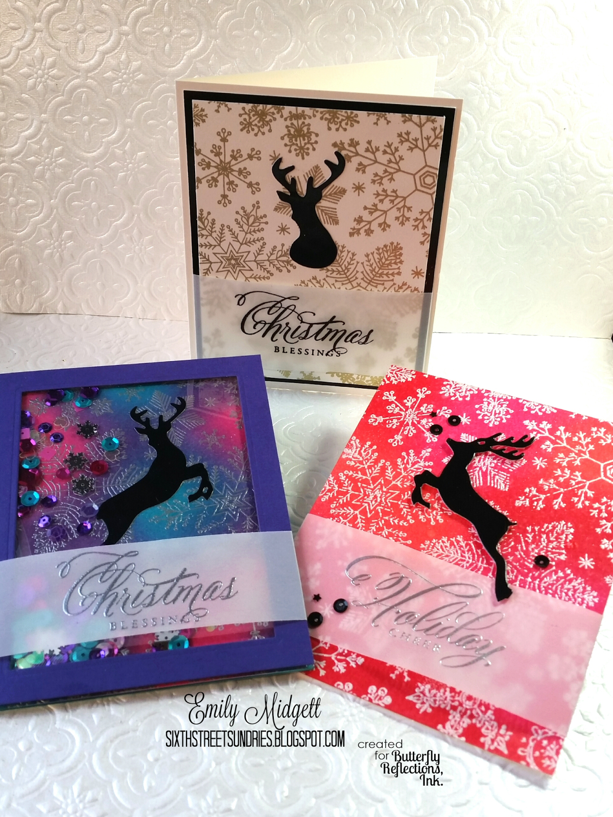
Happy Monday, everyone! Emily here today with a trio of cards for you. (I can't seem to make one card anymore.... It's a problem. For serious.) I thought I'd do something a little different this week. Last week, I was playing with my ink blending in conjunction with this beautiful Hand Drawn Snowflake background from Hero Arts, and I thought to myself that maybe I could do a "stepped up" tutorial: a fairly simple, easily mass produced card, then "step it up" once with some ink blending for a somewhat-easily mass produced card, and then for that really important person in your life, "step it up" even further with an ink blended shaker card. The unifying features of these cards are that they all feature the same heat embossed background stamp and the Stag Trio dies from Wplus9.

First: the simplest card of the three. This one would be super easy to mass-produce. I think this simple ivory-gold-black color scheme is just so classy, but the heat embossing of both the sentiment and the background really give it a handmade touch. First, a panel of ivory card stock cut to 3 3/4x5 inches is heat embossed in gold with that beautiful background. I then cut a mat using some glossy black card stock to 4x5 1/4 inches. I mounted the stag bust on the panel, then heat embossed the Wplus9 sentiment in black on a strip of vellum, which I wrapped around the snowflake and black panels, then adhered in the back to hide my scor-tape. I then adhered the whole thing to an ivory card base, and called it good. Easy peasy, flat as a pancake to make for quick and easy mailing, but definitely elegant.

Second: let's take it up a notch! (Did anybody else hear Emeril's voice when they read that?) I used the same background stamp, heat embossed in Silver Pearl this time on watercolor card stock. Instead of letting the simple beauty of the embossed images create a subtle background, I decided to bring them out even further with some Distress Ink blending for an emboss-resist technique. I blended three colors that I wouldn't normally think of for holiday cards: Festive Berries, Picked Raspberry, and Abandoned Coral. I know they aren't really wintery or even cool colors to coordinate with the "cool" snow falling in the background, but I think when paired with the leaping black stag silhouette, the colors are really so festive and exciting. (I was thinking how much I would LOVE a Christmas tree decorated in these colors!) You can't really tell, but I sprayed a bit of Tsukineko Shimmer spray over the top after the panel had dried just to add even more sparkle. Again, I heat embossed the sentiment on the strip of vellum, this time using silver embossing powder, and wrapped the strip around the back of the blended panel to hide the adhesive. A few black sequins helped to add balance, and I adhered the whole panel to a white card base.

Third: for the final, most involved and doubly "stepped up" card: a shaker! Now, anybody who has done a shaker before knows that they can be somewhat finicky working with all of that sticky foam tape, and die cuts, and sequins, and... it can just be a mess. That's why I feel like shakers only go to the people who really "get" cardmaking, the ones who appreciate what we do and don't just toss the card in the trash. This card definitely fits that bill. Again, I began by heat embossing a panel of watercolor card stock with that gorgeous background stamp, this time with silver embossing powder. I then took Mermaid Lagoon, Dusty Concord, and Picked Raspberries inks and blended them into the background. I put the pink and turquoise inks down first (as the reds and blues), then used the Dusty Concord ink to blend between so as to get a fairly natural blend between these colors. I have a thing for bokeh backgrounds, and I think this color combo looks like very holiday-ish bokeh, like lights on a Christmas tree, but without the crazy amount of blending and stamping that I've had to do in the past to achieve such a look. I took that blended panel and glued the black stag silhouette down, then threw in a bunch of sequins: Pansy and Deep Fuchsia, as well as some snowflakes and turquoise sequins from my stash. I wrapped the vellum sentiment strip over the top of my purple window panel, then adhered it to the ink blended card with foam tape. Super festive, special, and fun, no?
If you're still with me at the end of this novel, I appreciate it, and I hope you enjoyed my "step it up" tutorial!
Gorgeous...love the trio!
ReplyDeleteWow Emily, these are stunning, don't know which one is my favorite, thanks for the detailed explanation.
ReplyDelete